10 Exit-Intent Popup Examples for Higher Conversions
Want to stop visitors from leaving your site without taking action? Exit-intent popups can help.
These popups appear when users are about to leave, offering incentives like discounts, free shipping, or exclusive content. They’re designed to grab attention, re-engage visitors, and boost conversions. Here’s a quick look at the 10 examples covered in the article:
Le Creuset: Uses a countdown timer to create urgency with time-limited offers.
Elaluz: Offers a 15% discount for first orders, focusing on exclusivity and clean design.
Kiss My Keto: Combines discounts with a free keto guide for added value.
Patyka: Features a two-part offer - 10% off and a free sample for orders over $50.
Quince: Encourages purchases with free shipping for orders above $75.
GlobeIn: Tackles cart abandonment with tiered discounts and countdown timers.
Nguyen Coffee Supply: Focuses on customer service and educational content.
Pixelme: Uses mystery discounts to spark curiosity and engagement.
Skullcandy: Combines discounts with contest entries to drive sign-ups and sales.
Waitrose: Collects feedback with a customer survey to improve user experience.
Key Takeaways:
Clear Value: Highlight benefits like discounts or free content.
Timing: Trigger popups at the right moment, such as during exit intent.
Simple Design: Ensure popups are mobile-friendly and distraction-free.
Exit-intent popups are easy to customize and test, making them a powerful tool to turn leaving visitors into loyal customers. Start experimenting with these strategies today to see what works for your audience.
What is Exit-Intent Popup? Best Exit Intent Popups to Increase ...
1. Le Creuset's Time-Limited Offer

Le Creuset uses a popup with a countdown timer to encourage visitors to stay and make a purchase. When someone is about to leave the site, they’re presented with a limited-time offer, highlighted by the ticking timer. This creates a sense of urgency, prompting quick decisions and often persuading users to act before the timer runs out. It’s an effective way to turn potential exits into conversions. Next, let’s look at how offering direct discounts can encourage immediate purchases.
2. Elaluz's Direct Discount Popup

Elaluz keeps things simple and effective with its exit-intent popup, offering a 15% discount on first orders (using code WELCOME15). The messaging emphasizes exclusivity, creating a clear and enticing value proposition. This approach is paired with a clean, eye-catching design.
To draw attention, the popup dims the background, making the bold discount and "SIGN UP" button stand out. Visitors must provide their email to claim the discount, converting potential exits into leads. According to internal data, this strategy delivers conversion rates between 18-25% for exit-intent traffic.
Three key factors drive the success of this popup:
Instant Reward: The 15% discount is a solid incentive for first-time buyers.
Sense of Exclusivity: The messaging makes the offer feel special and limited.
Focused Design: Dimming the background removes distractions, keeping attention on the offer.
While other brands use similar tactics, Elaluz's popup performs better. For instance, beauty retailer Mochi Kids offers a 20% discount but only achieves an 18% conversion rate, compared to Elaluz's 25%. Regular updates to the popup's design and seasonal tweaks also contribute to its effectiveness.
3. Kiss My Keto's Clear Message

Kiss My Keto demonstrates how straightforward, on-brand messaging can make exit-intent popups more effective. Their popup communicates the offer clearly and directly to the audience.
The headline, "Want to Save on Premium Keto Products?", grabs attention immediately. It combines a discount for first-time buyers with a free keto guide, offering both immediate savings and helpful information - perfect for a health-focused audience.
Here’s what makes it work:
Value-Focused Copy: The text emphasizes both saving money and gaining useful resources.
Brand Alignment: The messaging stays true to the brand’s simple, no-frills tone.
Clear Call-to-Action: A bold button guides users effortlessly to the next step.
The design is clean and simple, with light keto-themed visuals that keep the focus on the offer. The popup appears after users have spent time browsing, targeting those already interested. A short form asks only for an email, first name, and keto experience level, making sign-ups quick and allowing for personalized follow-ups.
This kind of focused messaging doesn’t just engage - it converts. Next, we’ll look at how a two-part offer can enhance results.
4. Patyka's Two-Part Offer
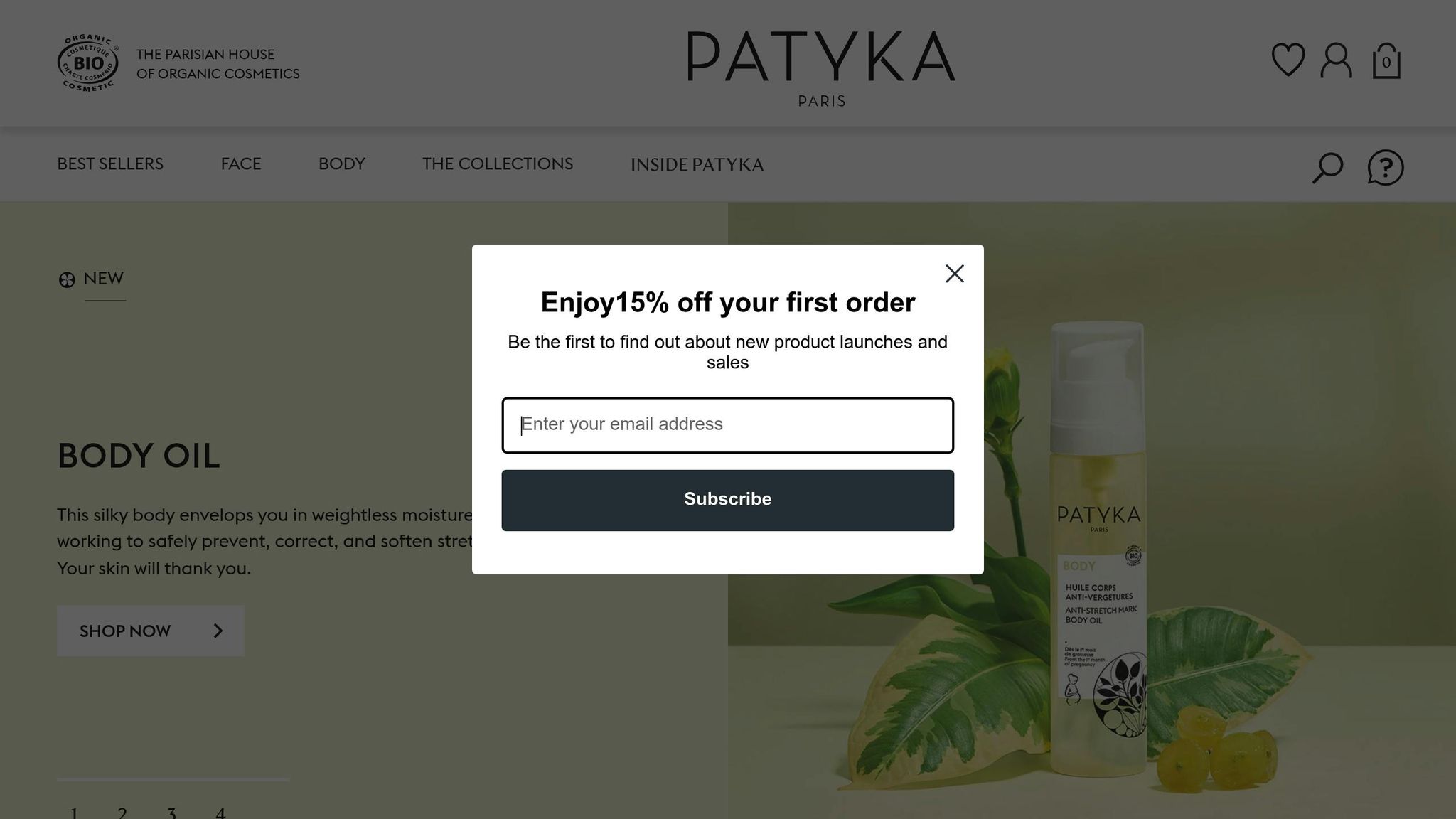
Patyka’s exit-intent popup shows how combining two incentives can create an effective offer. They pair a 10% discount for first-time buyers with a free luxury sample on orders over $50. This approach addresses both immediate savings and an added perk. Let’s break down the design elements that make this work.
The popup uses a split-screen layout to highlight both offers equally. On the left, the discount is emphasized with a bold "$" symbol and a "Claim Offer" button. On the right, a product image of the free sample is paired with a "Shop Now" call-to-action.
According to a 2023 Baymard Institute study, dual-offer strategies can improve conversions by 18–22% because they appeal to multiple customer motivations:
"Dual offers reduce bounce rates by 12–15% by addressing multiple objections", says conversion expert Neil Patel.
Here are some key design features that make this popup effective:
Clear visual hierarchy: Larger fonts highlight the most important offers.
Contrasting colors: Gold draws attention to the sample, while green emphasizes the discount.
Mobile-friendly layout: Offers are stacked vertically for smaller screens.
Localized content: Prices are shown in USD, and measurements use imperial units.
The popup is designed to enhance the shopping experience by using cookie logic to target first-time visitors only. The dual offer, which equals 25–30% of the average order value, catches attention while maintaining profit margins.
Patyka tailors its messaging for U.S. shoppers by using American spelling, promoting free returns, and clearly stating measurements (e.g., "1.7 oz sample"). Luxury skincare brands using similar dual-offer strategies have reported a 27% boost in conversion rates and a 15% increase in average order value. This layered approach not only reduces cart abandonment but also sets the stage for the next example: shipping-based offers.
5. Quince's Shipping Offer

Quince uses an exit-intent popup to turn hesitant shoppers into buyers by offering free shipping. When visitors are about to leave after browsing, the popup grabs their attention with a clear message: "Free Shipping on Orders $75+".
The popup design stands out with these key features:
Bold text that highlights the "$75+" threshold
Progress tracker showing how close the shopper is to earning free shipping
Countdown timer to create urgency with a limited-time offer
Mobile-friendly layout to ensure it looks great on any device
What makes it even smarter? The popup updates based on the cart's value. For example, if a cart totals $65, it says: "Add $10 more for FREE shipping!"
6. GlobeIn's Cart Recovery Popup

GlobeIn's cart recovery popup tackles abandoned carts by showing the items left behind and offering tiered discounts. It combines smart incentives and urgency to boost conversions.
Here’s what makes this popup work so well:
Product Visualization
Displays clear thumbnails of the abandoned items.
Features a "Your Cart" heading to make it feel personal.
Shows product names and any selected options for clarity.
Tiered Incentives
The popup includes discounts based on order value - 10% for smaller orders, 15% for larger ones. It even provides a pre-filled discount code that users can auto-copy for convenience.
Creating Urgency
A 10-minute countdown timer encourages quick action. Testing showed that adding this timer increased conversions by 17%.
"Wait! Your Craft Supplies Are Waiting" is displayed alongside visuals of the abandoned items. The promo code field is pre-filled with "SAVE15", a strategy that helped reduce cart abandonment by 34% in just three months.
The mobile version is designed for ease of use, with large, touch-friendly buttons, a vertical layout, and a quick 2-second load time.
If users close the popup, a follow-up email is sent right away to re-engage them. Similar popups have achieved conversion rates as high as 19.63%, proving that combining personalized reminders with time-sensitive deals can effectively bring back customers.
7. Nguyen Coffee Supply's Service Focus
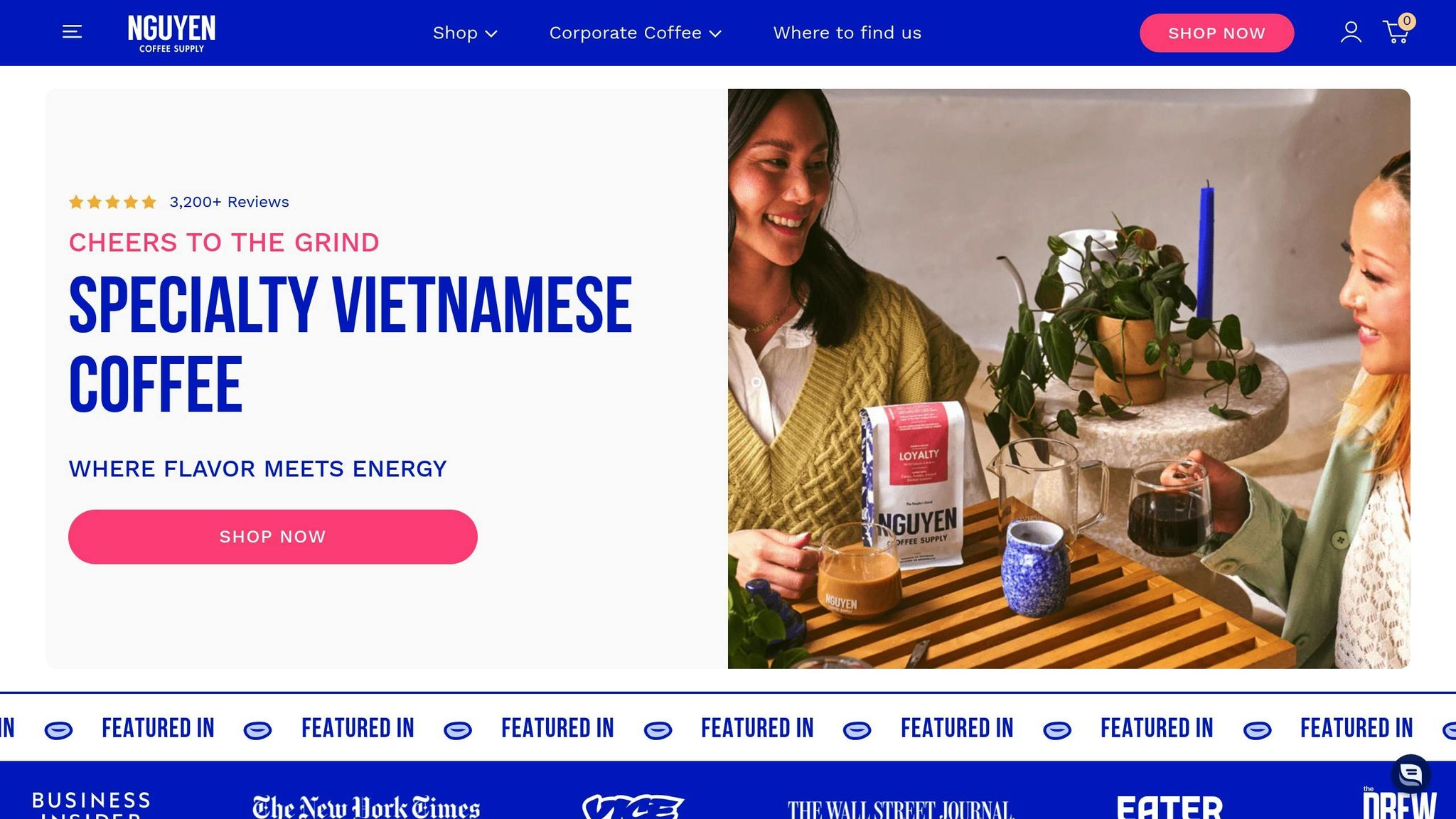
Nguyen Coffee Supply takes a different approach by prioritizing service over immediate sales. Instead of pushing products, the company uses its customer service to engage visitors and build trust. Their exit popup isn’t just a sales pitch - it’s a chance to connect by offering expert guidance and educational content that addresses common questions or concerns.
The popup provides brewing tips and personalized advice, helping visitors feel more confident. This thoughtful approach strengthens trust and creates deeper connections with potential customers.
8. Pixelme's Hidden Discount

Pixelme's exit-intent popup takes a creative approach by leveraging curiosity. Instead of immediately revealing a discount, it offers a mystery deal that’s only accessible after signing up with an email. This adds an element of surprise and encourages users to engage further.
The design is simple yet effective, with a headline that reads: "Unlock Your Mystery Discount." This grabs attention and sets the tone for the interactive experience that follows.
By playing on the excitement of the unknown, this tactic keeps visitors intrigued. Features like subtle animations and a countdown timer amplify the sense of urgency, making users more likely to act. This combination has been shown to increase email sign-ups and conversions.
The popup appears when a user shows exit intent but remains subtle. With animations and a friendly nudge like, "Before you go, try your luck!", it feels inviting rather than intrusive.
9. Skullcandy's Giveaway Popup

Skullcandy’s exit-intent popup effectively boosts conversions by offering a 20% discount alongside contest entries. This approach taps into key psychological principles to engage users.
Striking Visual Design
The popup uses Skullcandy’s recognizable black and red color palette, paired with product images. Its clean, simple layout ensures it works well on mobile devices, which is critical since 63% of visitors use smartphones to browse.
Strong Offer
The combination of a 20% discount and contest entry creates an appealing incentive that drives both excitement and participation.
"Marketing strategist Jane Doe suggests A/B testing different prizes to find what resonates best. For example, Skullcandy compared wireless earbuds to gift cards and found earbuds led to a 40% increase in sign-ups."
Campaign Performance
The Kilby Block Party campaign achieved impressive results:
Over 12,000 new email subscribers in just 72 hours
A 38% email capture rate (well above the 22% industry average)
A 27% purchase rate from users after signing up
The popup uses a double opt-in process to validate email addresses and comply with the CAN-SPAM Act. It only appears when visitors show exit intent, ensuring minimal disruption.
Element | Performance Metrics |
|---|---|
Average Conversion Rate | 22% during campaigns |
Monthly List Growth | 15% increase |
Post-Signup Purchase Rate | 27% within 60 days |
Campaign Duration | 72-hour window |
After signing up, users receive a follow-up sequence that includes a thank-you message, contest updates, and an extra 10% discount for their next purchase.
Key Trust Features
A clear "No purchase necessary" disclaimer
Links to the privacy policy
A simple, one-field email entry form
Mobile-friendly design
Social proof, such as "Join 10,000+ entrants"
10. Waitrose's Customer Survey

Waitrose has a unique approach to popups, focusing on customer feedback rather than chasing immediate sales. By doing this, they zero in on understanding customer frustrations and use that information to improve the overall shopping experience, which helps build stronger, lasting relationships with their customers.
When a visitor appears ready to leave the site, a popup prompts them to complete a survey. This allows Waitrose to gather useful insights that can guide product updates and service improvements, ultimately boosting customer satisfaction.
Instead of relying on discounts like many other examples, this strategy engages visitors while also creating a system for ongoing improvement. By turning potential exits into opportunities for feedback, Waitrose gains valuable insights that complement other conversion techniques.
Conclusion
Exit-intent popups are a powerful tool for converting visitors who are about to leave your site. Our analysis highlights some key elements behind their success across various implementations.
The most effective popups share three main traits:
Clear Value Proposition: Whether it’s Le Creuset’s limited-time discount or Nguyen Coffee Supply’s service-focused messaging, successful popups clearly communicate what’s in it for the user.
Timely Engagement: Popups that appear at just the right moment, like GlobeIn’s cart recovery or Quince’s shipping offers, tend to perform better.
Purposeful Design: Simple, action-driven designs - like Kiss My Keto’s messaging or Patyka’s two-step approach - encourage immediate responses.
These examples, such as Le Creuset’s urgency-based offer or Pixelme’s hidden discount, provide a roadmap for creating effective exit-intent popups.
To put these strategies into action, start by defining your goal. Whether you’re offering a direct discount like Elaluz or exclusive content access, make sure your offer resonates with your audience. Test everything - timing, messaging, design, and call-to-action placement - to see what works best.
Keep refining your approach. Use conversion data and user behavior insights to tweak your strategy over time. When done right, exit-intent popups can make a noticeable difference in your conversion rates.
FAQs
How can businesses customize exit-intent popups to engage their audience and boost conversions?
Exit-intent popups can be customized by aligning their design, messaging, and offers with your business goals and audience preferences. For instance, you can use discounts to reduce cart abandonment, free resources to capture email sign-ups, or exclusive offers to create urgency.
Tailoring the tone, visuals, and call-to-action to resonate with your target audience ensures the popup feels relevant and valuable, increasing the likelihood of engagement and conversions.
How can I test and optimize the timing and design of exit-intent popups to increase conversions?
To effectively test and optimize exit-intent popups, start by experimenting with timing triggers - such as the precise moment a user moves their cursor toward the browser's close button. Use A/B testing to compare different designs, copy, and offers, ensuring you identify what resonates best with your audience.
Focus on crafting a clear and compelling message with a strong call-to-action (CTA) while keeping the design clean and visually appealing. Additionally, analyze user behavior through tools like heatmaps or analytics to refine placement and timing. Regularly review performance metrics like bounce rates and conversion rates to make data-driven improvements.
What’s the best way to track the success of exit-intent popups for boosting conversions and engagement?
To measure the success of your exit-intent popups, focus on key metrics like conversion rates, click-through rates (CTR), and engagement levels. Analyze how many users take the desired action, such as subscribing to a newsletter, downloading a resource, or completing a purchase after interacting with the popup.
You can also use A/B testing to compare different designs, headlines, or offers to see which performs better. Additionally, monitor user behavior through analytics tools to track bounce rates and time spent on your site after the popup appears. These insights will help you fine-tune your strategy for maximum impact.