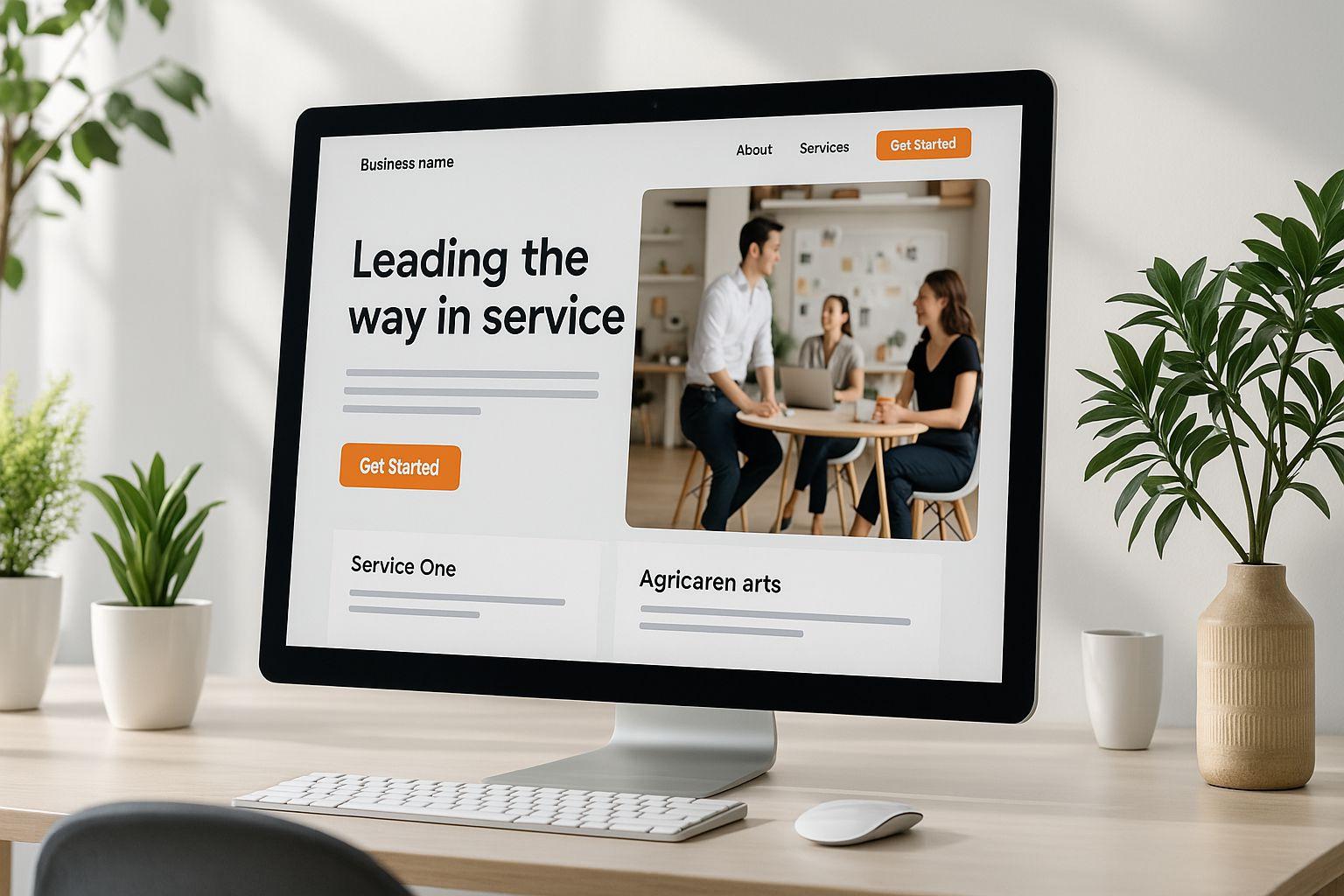
7 Essential Website Elements for Successful Course Creators

Here’s what your site needs to succeed:
Clear Course Descriptions: Explain what students will learn, who it’s for, and why it’s worth their time and money.
Easy Navigation: Use a simple menu to help visitors quickly find courses, resources, and signup options.
Mobile-Friendly Design: Make sure your website works smoothly on phones and tablets.
Secure Payments: Offer safe, user-friendly checkout options with multiple payment methods.
Social Proof: Add testimonials and success stories to build trust.
Email Signup Forms: Capture leads with well-placed forms offering valuable resources.
SEO Basics: Optimize your site for search engines so students can find you.
These elements work together to attract students, provide a great user experience, and drive enrollments. Ready to dive deeper? Let’s break it down step by step.
How To Create A Killer Online Course Website With ...
Writing Course Descriptions That Sell
Your course description is one of the most important tools to attract potential students. It can be the deciding factor in whether someone enrolls or moves on. A well-written description grabs attention and clearly communicates why your course is worth their time and money.
Start with a strong opening that speaks directly to your audience's biggest challenges. For instance, instead of saying, "Learn digital marketing basics", go for something like, "Discover proven digital marketing strategies to double your client base in just 90 days."
Key elements to include in your course description:
Clear outcomes: Share specific, measurable results students can expect.
Target audience: Define who the course is for.
Course structure: Highlight main topics and time commitment.
Prerequisites: Mention any required skills or tools.
Unique value: Explain what sets your course apart.
Pricing: Provide the cost in USD.
Call-to-action: Tell readers exactly how to enroll.
"A course description serves as a gateway to understanding the essence, content, and potential impact of your educational offering." - LearnWorlds Blog
How to Format Course Details
Use the SWBAT (Students Will Be Able To) framework to clearly outline what students will achieve by taking your course.
Section | Key Elements to Include | Example |
|---|---|---|
Introduction | Hook + Problem Statement | "Struggling to turn website visitors into paying customers?" |
Outcomes | 3-5 Specific Skills | "Create landing pages that convert at 15% or higher." |
Content Overview | Module Breakdown | "6 modules, 24 video lessons, 4 hands-on projects." |
Requirements | Tools + Prerequisites | "Basic HTML knowledge, access to WordPress." |
Time Investment | Duration + Pace | "8 weeks, 3-4 hours per week." |
Keep your descriptions between 150 and 300 words. Use bullet points to make the information easy to scan. Naturally integrate keywords, but make sure the text remains easy to read.
Emphasize standout features like live coaching, ready-to-use templates, access to a supportive community, certifications, or lifetime updates.
Write in an active, conversational tone. For example, instead of saying, "This course applies advanced teaching methods", say, "You'll learn through hands-on projects and practical examples."
"A great course description can be the decisive factor of whether a student signs up, or clicks away from your online course and never returns." - iSpringSolutions.com
Simple Website Navigation
Clear navigation is key to helping potential students find information quickly. If visitors struggle to locate what they need, they'll likely leave before exploring your courses.
Think of navigation as a roadmap guiding users to their desired content. Most visitors decide within seconds whether your site is easy to navigate.
Here’s how to structure your course website navigation effectively:
Navigation Element | Purpose | Best Practice |
|---|---|---|
Main Menu | Primary site sections | Keep it to 5–7 items maximum |
Course Catalog | Available courses | Organize by topic or level |
Student Resources | Support materials | Include FAQs and help documentation |
Account Access | Student dashboard | Use clear login/signup buttons |
Contact Options | Support channels | Make contact methods easy to find |
Focus on the pages that matter most to your audience. Place your most important items at the start of the menu, and position your contact page on the far right for easy access.
Essential Pages for a Course Website
Homepage
Highlight your course offerings and what sets them apart. Include a clear call-to-action that directs visitors to your most popular course or the course catalog.
Course Catalog/Directory
Display all your courses in an organized way. Use categories and filters to help students find what they’re looking for quickly. A grid layout with thumbnails and brief descriptions works well.
Student Success Center
Provide resources like getting started guides, technical requirements, FAQs, and support contact details.
About/Instructor Profile
Showcase your expertise and teaching approach. Include your credentials, teaching experience, student testimonials, and any notable media mentions.
Student Login Portal
Make it simple for enrolled students to access their courses. A prominent login button in the main navigation, ideally in a contrasting color, ensures it stands out.
Additional Tips to Improve Navigation
Use clear, descriptive labels for menu items (e.g., "View All Courses" instead of "Products").
Add a search bar for larger course catalogs.
Include breadcrumb navigation on course pages to help users track where they are.
Maintain consistent navigation across all pages.
Design buttons for easy recognition and place them strategically.
Making Your Site Work on Mobile
With 60% of website traffic coming from mobile devices, your course website needs to provide a smooth, fast experience on smartphones and tablets to turn visitors into students.
Here’s how to make sure your course website performs well on mobile:
Readable Text: Stick to a font size of at least 14px and organize content into short, easy-to-read sections.
Thumb-Friendly Navigation: Place important buttons and calls-to-action where they can be easily tapped with a thumb. Keep navigation simple and intuitive.
Simplified Forms: Remove unnecessary fields and enable autofill to make forms quicker to complete.
Fast Loading Speed: With 83% of users expecting pages to load in under 3 seconds, compress images and reduce HTTP requests to speed things up.
"As people increasingly search on their mobile devices, we want to make sure they can find content that's not only relevant and timely, but also easy to read and interact with on smaller mobile screens." - Google spokeswoman
Mobile Optimization Checklist
Feature | Implementation Tips | Impact |
|---|---|---|
Responsive Design | Use a mobile-responsive theme that adjusts to screen sizes | Delivers a consistent experience on all devices |
Image Optimization | Compress images with tools like kraken.io | Reduces load times significantly |
Navigation Menu | Use a clean hamburger menu with spaced-out items | Prevents accidental taps |
Video Content | Host videos on platforms like YouTube or Wistia | Improves playback and reduces load time |
Contact Options | Add clickable phone numbers and simple contact forms | Makes it easier for students to get in touch |
Real-World Example: In November 2020, NYU Tandon enhanced its mobile homepage by enlarging story blocks, making navigation smoother and improving readability.
To stay ahead of potential issues, regularly test your site using Google’s Mobile-Friendly Test tool. Also, disable autoplay for videos and ensure video players are responsive to save data and give users more control.
Setting Up Course Payments
After creating clear content and easy navigation, secure payment options are essential for turning interest into actual enrollments. Studies show that offering multiple payment methods can increase checkout conversions by up to 28%.
Key Payment Features:
Multiple Payment Methods: Accept major credit cards, digital wallets (like Apple Pay and Google Pay), and "buy now, pay later" options to cater to customer preferences.
SSL Encryption: Protect customer information and ensure compliance with PCI DSS standards for secure transactions.
Mobile-Friendly Checkout: Make sure payments work seamlessly on all devices.
Transparent Pricing: Clearly display course prices in US dollars with straightforward payment terms.
Improving Payment Processing
Use these strategies to create a smoother checkout experience:
Feature | Purpose | Impact |
|---|---|---|
Guest Checkout | Removes the need for accounts | Lowers cart abandonment rates |
Social Login | Simplifies user authentication | Speeds up the process |
Clear Refund Policy | Builds buyer trust | Boosts confidence in purchasing |
Payment Plans | Makes courses more affordable | Encourages more enrollments |
Tips for Structuring Payment Plans:
Request a larger upfront payment to ensure commitment.
Limit the number of installments to reduce risk.
Charge a small premium for payment plans compared to one-time payments.
Use drip content to minimize risks linked to payment plans.
PayPal reports that 69% of users feel more confident buying when PayPal is available. Businesses also see a 19% increase in impulse purchases when PayPal is offered alongside other payment methods.
Security Measures:
Use fraud protection tools.
Display security badges prominently.
Include clear contact details for customer support.
Provide transparent pricing and fee details.
Automate sales tax calculations for accuracy.
Incorporate these security practices into your site to build trust while maintaining engaging course content. Enable recurring billing to create steady revenue streams and improve customer retention.
Adding Student Success Stories
Student testimonials can significantly influence enrollment decisions. Research indicates that showcasing reviews on landing pages can boost conversion rates by up to 380%.
Where to Highlight Testimonials:
Homepage: Use short, impactful testimonials to immediately convey your course's value.
Course sales pages: Place relevant reviews near pricing details to reinforce purchase decisions.
Dedicated testimonials page: Compile an extensive collection of success stories for visitors to explore.
Email campaigns: Include testimonials in your nurture sequences to build trust and credibility.
Placing testimonials strategically ensures they reinforce the course's value at every stage of the visitor's journey.
Getting and Using Student Reviews
To create effective testimonials, focus on timing your requests and presenting them clearly.
When to Ask for Testimonials: Reach out during key moments, such as:
Right after students complete the course.
When they achieve noticeable results.
During milestone celebrations.
After they've successfully applied what they learned.
Questions to Ask for Strong Testimonials:
Question Type | Example | Purpose |
|---|---|---|
Before State | What challenges did you face before the course? | Highlights relatable struggles |
During Experience | What was your most valuable takeaway? | Showcases key benefits |
After Results | How has the course impacted your business or life? | Demonstrates real-world outcomes |
ROI Focus | What specific results have you achieved? | Provides measurable success stories |
These targeted questions help craft testimonials that clearly showcase your course's impact.
How to Present Testimonials Effectively:
Make your testimonials stand out by focusing on these elements:
Visual Appeal
Add high-quality headshots to make testimonials more relatable and trustworthy.
Variety in Formats
Use different types of testimonials to engage your audience:
Written reviews with specific outcomes
Video testimonials
Social media screenshots
Before-and-after case studies
Credibility Boosters
Build trust by including:
Full names and job titles
LinkedIn profiles or company websites
Timestamps of course completion
Specific metrics or results achieved
Extra Tips:
Embed testimonial request forms on your website, ensure you have permissions, and regularly update your collection.
Highlight diverse success stories to connect with a broader audience.
Refresh testimonials frequently to keep them relevant and engaging.
Email Sign-Up Forms
Email sign-up forms are a powerful way to connect with potential students. In fact, data shows email engagement has grown by 77% over the past year. To make the most of this channel, it’s important to optimize your forms for better results.
Strategic Form Placement
Where you place your sign-up forms can make a huge difference. Here are some high-impact spots:
Above the fold on your homepage
Course preview sections to capture interest
Blog post sidebars for easy access
At the bottom of valuable content
Exit-intent popups to catch users before they leave
Combine smart placement with key design elements to increase sign-ups.
Essential Form Elements
Make sure your forms include these must-have features:
A clear and compelling value proposition
Only the most necessary fields
A link to your privacy policy
GDPR-compliant consent checkboxes
Mobile-friendly design
A bold, easy-to-spot submission button
Once these basics are in place, you can focus on fine-tuning your forms for even better results.
Building Better Sign-Up Forms
Great sign-up forms are simple but deliver clear value. Here’s how you can take yours to the next level:
Value Exchange Components
Instead of generic calls-to-action like "Subscribe", tell users exactly what they’ll gain. For example:
Offer Type | Example Message | Impact on Conversion |
|---|---|---|
Free Resource | "Get our 10-page course creation checklist" | Makes the offer more appealing |
Early Access | "Be first to know when new courses launch" | Creates exclusivity |
Special Pricing | "Save 20% on your first course purchase" | Highlights a clear benefit |
Weekly Tips | "Get actionable teaching strategies every Tuesday" | Sets clear expectations |
Friction Reduction Techniques
Smart Field Usage
Only ask for the information you truly need.
Visual Optimization
Make your forms visually appealing with:
Contrasting colors for the submission button
Plenty of white space to keep things clean
Easy-to-read fonts for better usability
Trust Signals
Build confidence by including:
The number of current subscribers
Previews of downloadable resources
Mini-testimonials from satisfied students
"Dollars flow where friction is low." - Brian Halligan, INBOUND 2019
Post-Signup Experience
The process doesn’t end when someone signs up. Follow up immediately with a confirmation email that:
Welcomes them warmly
Delivers the promised resource or offer
Explains what to expect in future emails
Provides quick tips or immediate value
This follow-up strengthens the trust you’ve built and keeps new subscribers engaged.
Testing and Optimization
Once your form is live, track its performance closely. Key metrics to monitor include:
Completion rates
Field abandonment
Mobile vs. desktop conversions
A/B test results for different designs or messaging
To stay compliant with privacy regulations, ensure you:
Use clear consent language
Implement double opt-in when needed
Offer easy unsubscribe options
Maintain accurate subscription records
Search Engine Optimization Basics
With billions of searches happening daily, optimizing your website can greatly improve its visibility to potential students.
On-Page Optimization Essentials
To get your course pages to rank higher, certain elements need attention. Here's what to prioritize:
Keep your titles under 65 characters and meta descriptions under 155 characters. Naturally include your primary keyword in both, and craft descriptions that are engaging enough to drive clicks.
Content Structure: Organize your content with proper heading tags to create a clear hierarchy for both users and search engines. Here's an example:
Content Element | Best Practice | Example |
|---|---|---|
Main Heading (H1) | Course name + keyword | "Complete Digital Marketing Course for Beginners" |
Subheadings (H2) | Key course sections | "Course Curriculum" or "Learning Outcomes" |
Supporting (H3) | Specific topics | "Social Media Marketing Module" |
Once you've nailed your on-page elements, make sure the technical aspects of your site are just as polished.
Technical SEO Foundations
Search engines need to easily navigate and understand your course website. Here's what to address:
Site Speed Optimization
Compress images used in course previews
Use appropriate file formats
Enable browser caching
Switch to SSL (HTTPS) for secure browsing
Mobile Responsiveness
Since mobile usability impacts search rankings, your site must function perfectly on smaller screens. Ensure:
Text is easy to read without zooming
Buttons and links are spaced for easy tapping
Videos load seamlessly
Content Strategy for Course Pages
Search data shows that strong course pages answer common student questions. Include:
Thorough course descriptions
Clear learning outcomes
Instructor qualifications
Success stories from past students
An FAQ section
Once your content is solid, apply targeted SEO strategies to maximize visibility.
SEO Tips for Course Pages
Here are some proven tactics to help your course pages rank better:
Keyword Research
Course-specific keywords often outperform broad terms. Use tools like Google Keyword Planner to discover what potential students are searching for.
Content Quality
Write detailed course descriptions that naturally include:
Primary keywords in key sections
Related terms and synonyms
Clear value propositions
Specific course outcomes
Link Building
Boost your site's authority by:
Securing features on educational resource websites
Writing guest posts showcasing your expertise
Sharing engaging course previews
Partnering with industry-relevant websites
Track your SEO progress with tools like Google Search Console. Regularly updating your course content and maintaining technical optimizations will help sustain and improve your rankings over time.
Conclusion
Creating a successful course website involves getting several key elements right. Tonner Jackson, CEO of Course Studio, puts it best:
"Your website acts as your stage, store, and community center all in one. It's where casual visitors transform into committed learners, and where fleeting engagements can transform into lasting relationships".
When done right, these elements work together to attract and convert visitors into students. From clear course descriptions to effective SEO, every piece plays an important role in turning interest into action.
Here are a few practical steps to keep your website running smoothly:
Content and Performance: Regularly update your content and keep an eye on Core Web Vitals. Make sure your site is mobile-friendly for the best user experience.
Email List Building: Offer helpful, targeted content to encourage visitors to subscribe to your email list.
Ongoing Improvements: Use data and user behavior insights to refine your website and boost engagement.
Your website is the heart of your course business. It’s where potential students explore your offerings and connect with your expertise. By focusing on these essentials, you’ll create a professional, engaging platform that drives enrollments.
Think of your website as a living, evolving part of your business. Regular updates and smart adjustments will keep it effective as online trends and tools change. This approach ensures your site remains a valuable asset for growing your course creator business.